User guide
Introduction
AgileVariantMapper is designed both to visualise and to re-genotype sequence variant data from exome sequencing projects, with the particular aim of mapping recessive disease loci in consanguineous individuals. The genotype data can be exported as a tab-delimited text file that can then be analysed using AutoSNPa or IBDFinder. (If data from a number of individuals has been generated using AgileGenotyper, AutoSNPa may be more appropriate, since AgileGenotyper creates files with a consistent set of previously known sequence variants. On the other hand, when the variant data are either (a) derived ab initio, as sequence calls differing from the reference sequence, or (b) include SNP microarray data, IBDFinder should be used.)
File formats used by AgileVariantMapper.
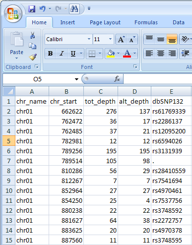
Figure 1: The format of the tab-delimited text file used by AgileVariantMapper; each column must have the correct header title text.
AgileVariantMapper can import data in three different formats:
1) The format used by the other members of the Agile suite of sequence analysis programs, as described here.
2) The format exported by AgileGenotyper, which can also be imported by AutoSNPa and IBDFinder.
3) A tab-delimited text file (used in conjunction with the *.xls file extension) as shown in Figure 1 and described below.
The tab-delimited text file must contain columns identifying the chromosome, chromosomal position, the read depth of the two commonest nucleotides, the read depth of the alternative base and if it has one, the RS number of the variant. The order of these columns within the file is not important, but the first line of the file most contain the correct titles for each column, as shown in Figure 1. It is not necessary to specify the nucleotides corresponding to each allele.
Importing Data
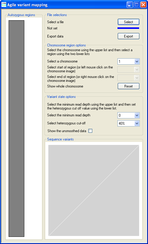
Figure 2: Data import using the button (underlined in blue).
Data are loaded into AgileVariantMapper by pressing the button (underlined in blue in Figure 2), selecting the required file extension and then choosing the data file.
Interpreting and manipulating the data
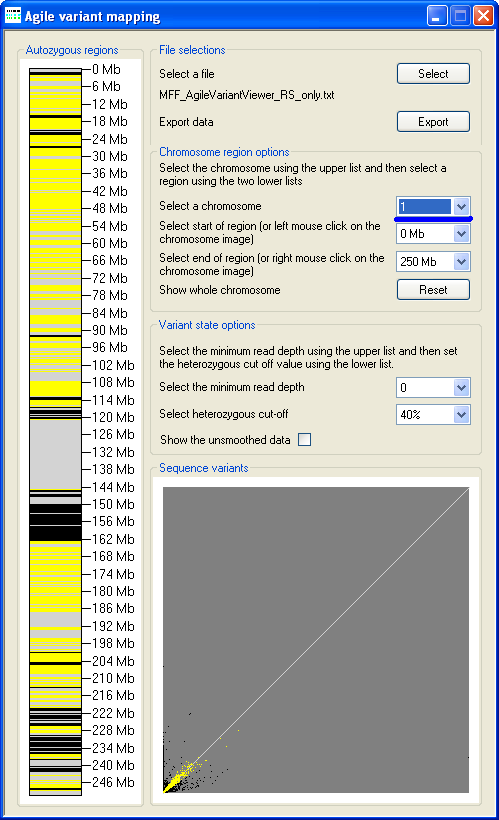
Figure 3: The current chromosome is selected using the chromosome list (underlined in blue).
The variant genotypes are displayed in a similar manner to AutoSNPa, with heterozygous variants represented by yellow horizontal lines and homozygous variants in black. Consequently, autozygous regions can be visualized as an extended block of black horizontal lines, interrupted by few if any yellow lines. In Figure 3, autozygous regions can be seen around the Chromosome 1 centromere (116–163 Mb) and in the region between 220–242 Mb, along with a number of possible smaller regions scattered along the chromosome. By default, all the chromosomes are displayed scaled to the same length as Chromosome 1.
Viewing a region
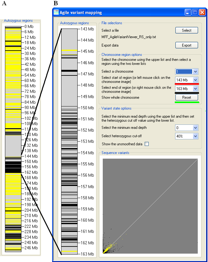
Figure 4: The region of Chromosome 1 at 143–163 Mb has been selected, to show the genotype data in the autozygous region in more detail. The beginning and end of a region to be displayed are selectable using the list boxes underlined by the red and black lines. The view can be reset to the default values by pressing the button (underlined in green).
The Chromosome region options panel contains three list options. The first (underlined in blue) allows the user to select the chromosome. The other two lists allow a specific region to be expanded, with the start point selected using the list underlined in red (Figure 4) and the end point using the list underlined in black. Alternatively, a region may be selected by clicking the left mouse button over the start point on the chromosome diagram, and right-clicking over the end point. In Figure 4, the autozygous region at 143–163 Mb on Chr. 1 has been selected to show the data in more detail. Pressing the button returns these selections to their default values.
Data smoothing
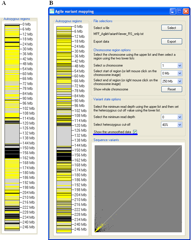
Figure 5: To view the raw unsmoothed data, use the tick-box.
By default, the displayed genotype data are smoothed, to lessen the visual impact of incorrectly scored genotypes (Figure 5A). To view the raw, unsmoothed data, tick the box (underlined in blue in Figure 5B).
Minimum read depth cut-off
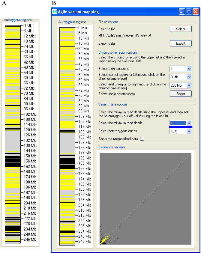
Figure 6: Increasing the cut-off value (Figure 6B) alters the apparent extent of the autozygous regions as compared to the default cut-off value (Figure 6A).
As well as the tick-box, the Variant state options panel includes the and list options. Increasing the minimum read depth cut-off value causes variants with a total read depth less than the cut-off value to be ignored. In Figure 6, this manifests as a reduction in the apparent size of the autozygous regions; however the effect may vary between individual datasets. Typically, during the generation of the imported data, the variants will already have been filtered for read depth, and so a cut-off value of 0 will often be appropriate.
Heterozygous cut-off value
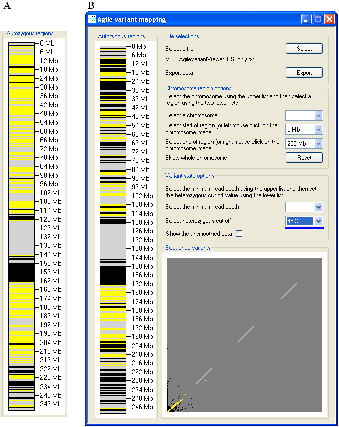
Figure 7: The effect on the apparent extent of autozygous regions, due to changes in the value, is greatest when the value is increased above its default.
Similarly, adjusting the value affects the apparent extent of autozygous regions, with a value above the default generally having a greater effect than a reduction (Figures 7 and 8). The proportion of sequence variants that are scored as homozygous or heterozygous is indicated in the graph at the bottom right of the window. Each sequence variant is shown as a dot, with the x-axis indicating the read depth of the reads containing the reference allele and the y-axis showing the read depth of the variant allele. Consequently, homozygous variants are plotted along the y-axis while heterozygous variants should trend along the white diagonal. To match the chromosome diagram, heterozygous variants are shown as yellow dots and homozygous variants as black. If the total read depth of a variant position falls below the cut-off, it is drawn as a white dot.
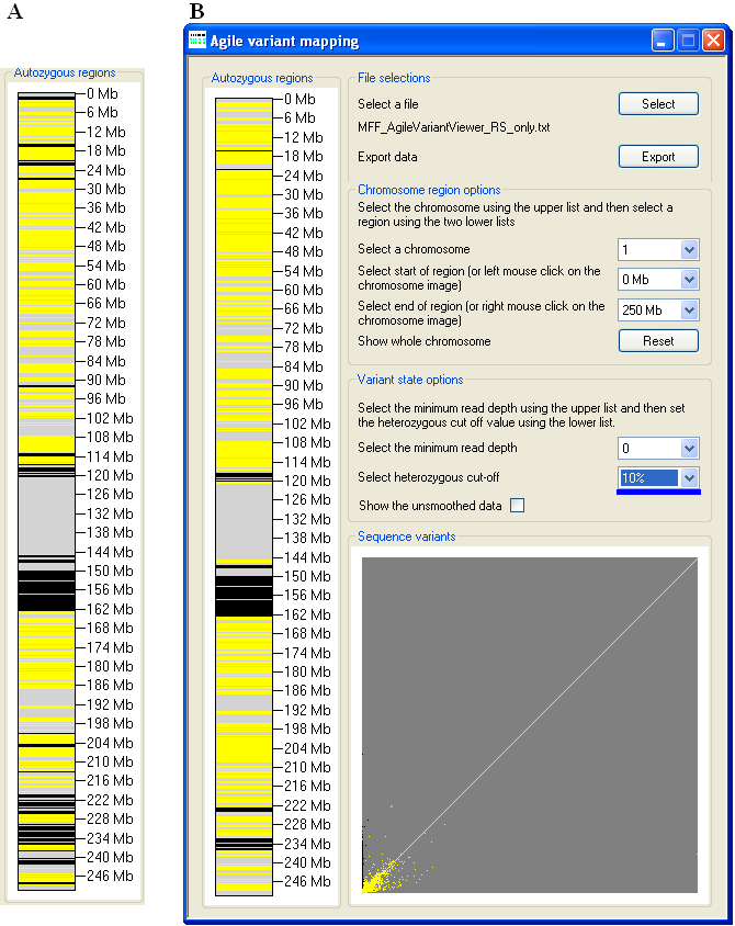
Figure 8: There is a smaller effect on the apparent size of autozygous regions, when the value is reduced below its default.
The effect of different sources of data
AgileVariantMapper can display data generated by AgileAnnotator or AgileGenotyper, or correctly formatted data from another source. However, there may be important differences in the underlying data in each of these cases, which may result in apparent differences in the extent of the autozygous regions (Figure 9). These differences concern the number of sequence variants and the frequencies of the different genotypes. In data generated by ab initio detection of variants differing from the reference sequence, variants tend to be fewer in number; there is also an under-representation of homozygous reference sequence genotypes, when compared to data derived from AgileGenotyper, since the latter program concerns itself with known polymorphic positions, most of which will be homozygous wild-type.
To allow for these differences, when displaying data from AgileGenotyper, homozygous variants are drawn first, after which heterozygous markers are drawn over the homozygous ones. This has the effect that autozygous regions are identified by the absence of heterozygous variants. Conversely, when the data are derived from the ab initio detection of non-wildtype positions, there will be a relative excess of heterozygous variants, a high proportion of which may actually represent sequencing errors. With this type of data, heterozygous variants are therefore drawn first and then the rarer homozygous positions are overlaid on the heterozygous variant data. This leads to a situation in which autozygous regions are identified by the presence of blocks of homozygous variants.
Figure 9 shows images of Chromosome 1 in situations where the genotype data were generated by each of these different methods. In Figure 9A, the data were created by AgileAnnotator and filtered by AgileKnownSNPFilter, following which only the variants with RS numbers were exported by AgileVariantViewer. Figure 9B, in contrast, shows data generated by AgileGenotyper.
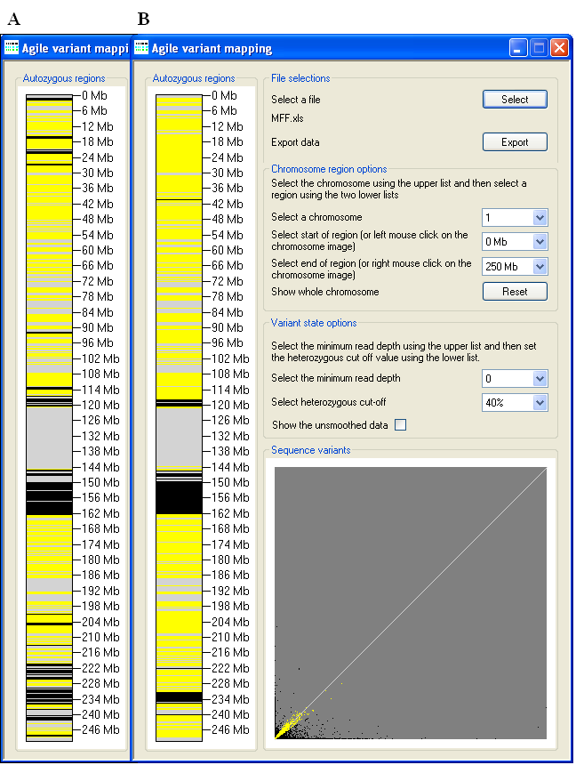
Figure 9: The exact extent of autozygous regions varies with the type of underlying data. Figure 9A shows data derived from the identification of sequence variants using AgileAnnotator, while Figure 9B shows data derived from the genotyping of ~0.5 million preselected known polymorphic regions by AgileGenotyper. A complete comparison of data from three individuals analysed in different ways can be seen here, here and here.
Exporting the genotype data

Figure 10: An example of a image exported by AgileVariantMapper showing data spanning a single chromosome.
AgileVariantMapper can export data in a number of ways: as a tab-delimited text file for further analysis by AutoSNPa or IBDFinder; as a single image displaying the data as currently displayed (Figure 10); or as a web page containing one image for each chromosome. (An example of a web page derived from data exported by AgileVariantViewer, including only variants with a RS number, is here).
Comparison of autozygous regions identified by different methods
To serve as examples of the capability of AgileVariantMapper to identify autozygous regions, some comparisons with SNP microarray data are shown in Figure 11. Genotypes derived from an Affymetrix Axiom microarray dataset (left-hand lanes) were compared to data generated by AgileVariantMapper, either using variants identified ab initio by analysis of the exome read depth data, or by scoring the genotypes of known polymorphic positions. For each of the disease-causing genes AGK, FARS2 and MFF, Figure 11 shows the autozygous regions surrounding the deleterious sequence variant; the full genome-wide comparisons can be seen here, here and here.
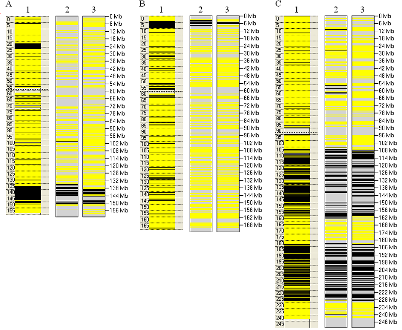
Figure 11: Autozygous regions containing three different disease genes (panels A, B and C). These are located at Chr.7:141 Mb (AGK), Chr.6:5.5 Mb (FARS2) and Chr.2:228 Mb (MFF) respectively. In each panel, the images are derived from: lane 1, Axiom SNP genotypes; lane 2, variants identified by ab initio analysis of the read depths at each position in the exome data; lane 3, the genotypes of known polymorphic positions as determined using the exome data.
Autozygosity mapping with AgileVariantMapper
This example illustrates the combining of data from unrelated affected individuals with the same recessive disorder. Exome data from three unrelated individuals affected by 3M syndrome and found to harbour CCDC8 mutations (Chr.19, 46.9 Mb) were used to identify autozygous regions. The results for Chromosome 19 are shown in Figure 12, while the entire analysis including all the autosomes can be seen here.
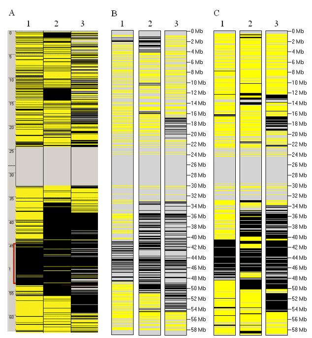
Figure 12: A comparison of the autozygous regions identified on Chr.19 among patients homozygous for CCDC8 (~46.9 Mb) mutations. Panels A to C represent respectively: Affymetrix SNP 6.0 data, variants identified ab initio in the exome data, and genotypes at known polymorphic positions.